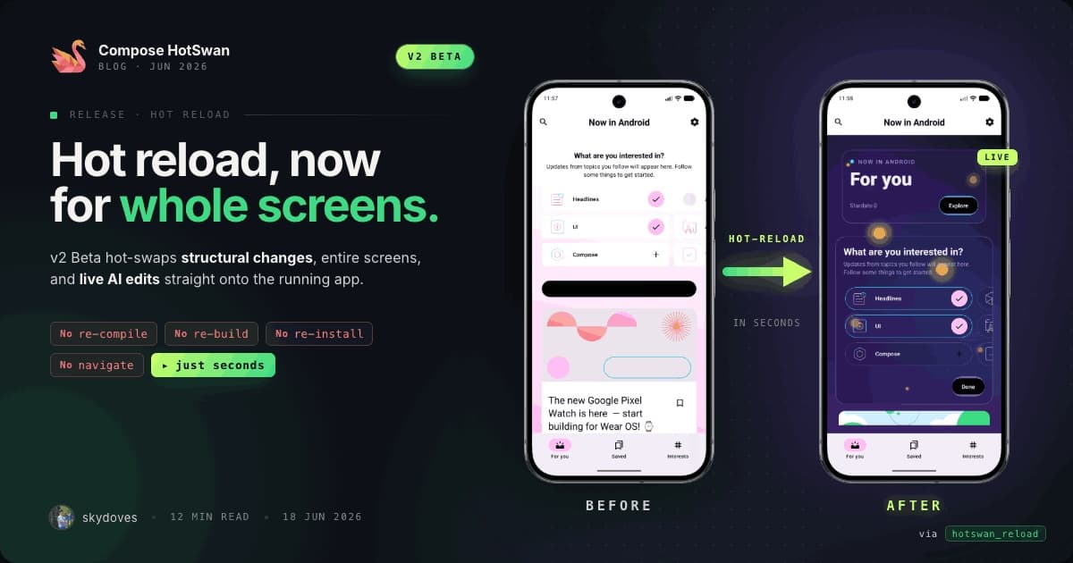
Compose HotSwan Blog
Compose Preview Renders Differently Than Your Real Device. Here's Why.

April 14, 2026 · 14 min read

Photo by supardisign @ Unsplash
Android Studio's Compose Preview is one of the most used tools in Compose development. You annotate a function with @Preview, and the IDE renders it in a panel next to your code. No device, no emulator, no build/run cycle. It feels instant. But if you have ever placed a Preview side by side with the same composable running on a real device, you have likely noticed that they do not look the same. Colors are slightly off. Fonts render differently. Spacing feels wrong. An image that loads fine on device shows a blank placeholder in Preview. A theme that looks correct on a Pixel 8 renders with unexpected defaults in the IDE panel. These differences are not bugs. They are consequences of how Preview rendering actually works, and understanding them requires looking at the rendering engine itself.
In this article, you'll explore the rendering pipeline behind Compose Preview, how layoutlib bridges Android's rendering stack to the desktop JVM, where font and text rendering diverge between the IDE and a real device, how image loading libraries behave in a Preview environment, how system UI and window insets differ, and why theming and Material components sometimes produce different visual results. You'll also look at how running previews on a real device with Compose HotSwan eliminates these discrepancies entirely.
The Fundamental Problem: Rendering Android UI Without Android
Compose Preview faces a challenge that sounds simple but is technically demanding: render Android UI inside a JVM desktop process. Android applications run on ART (Android Runtime) with access to system services, hardware accelerated rendering, the SurfaceFlinger compositor, and the full Android framework. The IDE has none of these. It runs on a standard desktop JVM with no Android framework loaded.
Consider a simple composable:
1@Preview
2@Composable
3fun ProfileCard() {
4    Card(
5        modifier = Modifier.padding(16.dp),
6        colors = CardDefaults.cardColors(
7            containerColor = MaterialTheme.colorScheme.surface
8        )
9    ) {
10        Row(modifier = Modifier.padding(12.dp)) {
11            AsyncImage(
12                model = "https://example.com/avatar.jpg",
13                contentDescription = null,
14                modifier = Modifier.size(48.dp).clip(CircleShape)
15            )
16            Column(modifier = Modifier.padding(start = 12.dp)) {
17                Text("Jaewoong Eum", style = MaterialTheme.typography.titleMedium)
18                Text("Android Engineer", style = MaterialTheme.typography.bodySmall)
19            }
20        }
21    }
22}
On a real device, this renders a card with a loaded profile image, system font rendering, correct Material 3 surface color from the device's dynamic color palette, and proper elevation shadow with hardware acceleration.
In Preview, the image is blank (no network access), the font metrics differ slightly, the surface color falls back to a default because there is no dynamic color provider, and the elevation shadow uses a software approximation. Same code, different pixels.
Layoutlib: Android's Rendering Engine for the Desktop
The bridge between Android rendering and the desktop JVM is a library called layoutlib. This is not a Compose specific tool. It predates Compose entirely. Layoutlib has been the rendering backend for the Android Studio Layout Editor since the early days of XML layouts, and Compose Preview reuses the same infrastructure.
What layoutlib is
Layoutlib is a modified build of the Android framework that can run on a desktop JVM. Google takes the Android source code (the android.view, android.graphics, android.widget packages and their dependencies), strips out anything that requires hardware or system services, replaces those parts with desktop implementations, and compiles the result into a JAR that the IDE can load.
The rendering pipeline works like this: the IDE creates a fake Context and Resources with your project's resource tables loaded, instantiates the composable (or inflates the XML layout), runs the measure and layout passes, then renders the result to a BufferedImage in memory. The image is displayed in the IDE panel.
What layoutlib replaces
The substitutions are extensive:
- Canvas and Paint. Android's
Canvasis backed by Skia, which uses GPU acceleration on device. Layoutlib provides its own software implementation of theandroid.graphics.CanvasAPI that renders to an in-memory bitmap. The rendering paths are different, and anti-aliasing, sub-pixel rendering, and color blending can produce visually different results. - Typeface and font loading. On device,
Typefaceloads fonts from/system/fonts/through the native Skia font stack. Layoutlib loads fonts from the SDK's bundled font files through a compatibility shim (LayoutlibFontResourceLoader), bypassingResourcesCompatentirely. The hinting, kerning, and sub-pixel positioning differ between the two rendering stacks. - System services.
WindowManager,DisplayManager,Configuration, and other system services are replaced with stubs that return hardcoded or configurable values. There is no real display, no real density, no real locale. These are simulated based on the Preview annotation's parameters and the device profile you select in the IDE. - Hardware acceleration. On device,
RenderNode,HardwareRenderer, and the display list system handle elevation shadows, clip paths, and blend modes efficiently on the GPU. Layoutlib must approximate these effects in software. Shadows are simulated, not physically rendered.
Font Rendering: The Most Visible Difference
The most noticeable difference between Preview and device is usually text. Characters appear at slightly different sizes, line breaks happen at different positions, and the overall "feel" of text is different. This is because the text rendering stack is entirely different.
On device
Android uses the HarfBuzz text shaping engine with Skia for rasterization. The font files in /system/fonts/ are the Roboto family (for Latin scripts) plus hundreds of supplementary fonts for other scripts. HarfBuzz handles complex text shaping: ligatures, kerning pairs, bidirectional text, and emoji cluster boundaries. Skia rasterizes the shaped glyphs with sub-pixel anti-aliasing tuned for the device's display characteristics (LCD sub-pixel layout, display density, gamma correction).
In Preview
Layoutlib provides its own font rendering path that loads fonts from the Android SDK's bundled set rather than a real device's /system/fonts/. The Compose tooling layer uses LayoutlibFontResourceLoader, which calls context.resources.getFont() directly (bypassing ResourcesCompat) to load resource fonts. While the same Roboto font family is available, the rendering parameters differ.
Layoutlib's software renderer and Skia apply different hinting strategies. Hinting adjusts glyph outlines to align with the pixel grid, and the two engines make different alignment decisions. Device rendering positions glyphs at sub-pixel coordinates for smoother text flow, while layoutlib's renderer may snap glyphs to whole-pixel boundaries depending on the platform. If glyph widths differ by even a fraction of a pixel due to different hinting, a line of text that fits on device may wrap in Preview, or vice versa.
The result is that text in Preview is approximately correct (same font family, same sizes in dp, same styles) but not pixel identical. For most development purposes this is fine. But if you are doing precision layout work where text must fit exactly within a container, Preview can be misleading.
Image Loading: The Network Boundary
Image loading libraries like Coil, Glide, and Fresco do not work in Preview. This is one of the most common sources of confusion for developers.
Why images don't load
Preview runs inside the IDE process on the desktop JVM. There is no Android Application context with a proper lifecycle. More importantly, image loading libraries depend on infrastructure that does not exist in the Preview environment.
Network requests require a running event loop and thread pool, which are not set up. The app's internal storage directory (used for disk cache) does not exist. Android's Bitmap class in layoutlib is a stub that wraps a BufferedImage, so the native bitmap memory management that Glide and Fresco rely on is not available. Coroutine dispatchers behave differently from Android's runtime dispatchers. The result is that image loading libraries silently fail in Preview without producing an error.
The placeholder pattern
The standard workaround is to provide a placeholder and error drawable:
1AsyncImage(
2    model = imageUrl,
3    placeholder = painterResource(R.drawable.placeholder),
4    error = painterResource(R.drawable.placeholder),
5    contentDescription = null,
6)
In Preview, AsyncImage never completes the network request. It displays the placeholder immediately and stays there. On device, it shows the placeholder briefly, then transitions to the loaded image. This means your Preview always shows the loading state, never the loaded state.
Some libraries offer Preview specific integrations. Coil's LocalImageLoader can be overridden with a fake loader that returns predefined images. But this requires additional setup that many projects skip, and the preview image may not match the actual proportions and content of the real image.
System UI and Window Insets
On a real device, your composable exists within the system's window hierarchy. The status bar, navigation bar, display cutouts, and software keyboard all affect the available space. In Preview, none of these exist.
Insets in Preview vs device
If your composable uses WindowInsets:
1Scaffold(
2    modifier = Modifier.fillMaxSize(),
3    contentWindowPadding = WindowInsets.systemBars,
4) { innerPadding ->
5    Content(modifier = Modifier.padding(innerPadding))
6}
On device, WindowInsets.systemBars returns real values: 24dp for status bar, 48dp for gesture navigation bar, varying for display cutouts. In Preview, WindowInsets.systemBars returns zeros. The content renders as if there are no system bars, which means layout proportions differ from what the user sees.
You can partially address this by configuring the @Preview annotation:
1@Preview(showSystemUi = true, device = Devices.PIXEL_7)With showSystemUi = true, layoutlib adds a simulated status bar and navigation bar to the rendering. But these are visual approximations. The simulated status bar shows a fake clock and icons, but the inset values may not exactly match the real device. And features like dynamic island cutouts, punch hole cameras, or curved edges are not simulated.
Edge to edge rendering
If your app uses edge to edge rendering ( enableEdgeToEdge()), the difference becomes more pronounced. On device, content draws behind the status bar and navigation bar, with padding applied via insets. In Preview, the edge to edge behavior is either absent or approximated differently, depending on the layoutlib version.
Theming: Material You and Dynamic Color
Material 3's dynamic color system extracts colors from the user's wallpaper on device. This is one of the most visually impactful differences between Preview and device.
On device
dynamicDarkColorScheme(context) and dynamicLightColorScheme(context) call into the system's WallpaperColors service to get the current wallpaper's dominant colors, then generate a full Material 3 color scheme from those colors. Every user sees different primary, secondary, tertiary, surface, and background colors.
In Preview
There is no wallpaper service. dynamicDarkColorScheme and dynamicLightColorScheme call into system color resources ( android.R.color.system_neutral1_*) which layoutlib resolves to default values. The result is a generic color scheme that does not match any real device's dynamic theming. Most apps handle this with a fallback:
1val colorScheme = if (Build.VERSION.SDK_INT >= Build.VERSION_CODES.S) {
2    dynamicDarkColorScheme(LocalContext.current)
3} else {
4    darkColorScheme()
5}
In Preview, Build.VERSION.SDK_INT returns the SDK version configured in the Preview annotation's apiLevel parameter. If it's 31+, the code tries to call dynamicDarkColorScheme, which fails because there is no wallpaper service. Many theme implementations add an explicit LocalInspectionMode.current check:
1val colorScheme = if (LocalInspectionMode.current) {
2    darkColorScheme()
3} else if (Build.VERSION.SDK_INT >= Build.VERSION_CODES.S) {
4    dynamicDarkColorScheme(LocalContext.current)
5} else {
6    darkColorScheme()
7}
LocalInspectionMode.current returns true when running inside Preview. This gives you a consistent fallback, but it means your Preview never shows the actual dynamic colors the user will see.
Animation and Interactivity: Static by Default
Preview renders a single static frame. Animations do not run, gestures do not fire, and state changes do not occur. A composable with animateContentSize(), AnimatedVisibility, or rememberInfiniteTransition will render its initial state and stay there.
Android Studio provides an "Interactive Preview" mode and an "Animation Preview" mode that partially address this. Interactive Preview runs the composable in an actual Android runtime (via an emulator), which makes it functional but slow to start. Animation Preview lets you scrub through animation timelines, but it requires specific integration with the @Preview annotation.
For most development workflows, the static nature of Preview means you see the default state of your UI, not the state the user will see after data loads, animations complete, and interactions occur.
Density and Screen Size: Close but Not Exact
The @Preview annotation lets you configure width, height, and density:
1@Preview(
2    widthDp = 360,
3    heightDp = 800,
4    fontScale = 1.0f,
5)
These values are passed to layoutlib's simulated Configuration and DisplayMetrics. The rendering respects these values for layout calculations, so a composable that takes 360.dp width will render at the specified width.
However, there are edge cases. On device, dp to px conversion uses the actual display density (e.g., 2.625 for 420dpi), while Preview derives density from the device profile, which may round differently. Resource qualifiers like values-sw360dp are resolved based on the Preview's configured dimensions, which may not match the device you are targeting. Foldable devices, multi-window mode, and split screen configurations are not simulated in standard Preview.
When Preview Is Enough and When It Is Not
Preview is a valuable tool for rapid iteration on layout structure, component composition, and basic styling. It lets you render a single composable in isolation without the surrounding app infrastructure, compare multiple configurations side by side, and get sub-second visual feedback after code changes without a device or emulator. For most layout and styling work, this is more than enough.
Preview reaches its limits when you need pixel accurate rendering, because font metrics, shadows, and color reproduction differ from what runs on a real device. It cannot load network content, so images, API responses, and dynamic data remain as placeholders. System UI elements like the status bar, navigation bar, display cutouts, and keyboard are either absent or approximated. Material You dynamic colors from the device wallpaper are not available. Animations and gesture interactions render as a single static frame.
For the cases where Preview falls short, running the composable on a real device remains the ground truth. The next section explores one approach to bridging that gap.
Previewing on a Real Device: Compose HotSwan
Compose HotSwan takes a different approach to the Preview problem. Instead of simulating Android rendering on the desktop, it runs your @Preview composables directly on a connected device or emulator. The rendering you see is the rendering your users will see: real fonts, real system UI, real image loading, real dynamic colors.
Preview Runner: One composable, one click
The Preview Runner adds a play button to the gutter next to every @Preview function in your editor. Click it, and the composable launches on your connected device in under a second. No full app build, no navigation to the right screen. The composable renders in isolation, exactly as it would inside your app, but with the real Android rendering stack.
This means every divergence covered in this article disappears. Font rendering uses the device's Skia stack, not layoutlib's approximation. Network images load through Coil or Glide as they would in production. Elevation shadows are hardware accelerated. Dynamic colors come from the device's actual wallpaper. The status bar, navigation bar, and display cutouts are real.
Capturing every Preview as a screenshot
For teams that need visual documentation or want to track UI changes over time, the captureAllPreviews Gradle task scans your project for every @Preview function, launches each one on a connected device, and captures a screenshot. The result is an HTML catalog you can browse, search, and share.
Because the screenshots are taken on a real device, they include everything Preview cannot show: loaded images, system UI, correct font metrics, and real Material You theming. The task runs in CI with GitHub Actions, so the catalog can update automatically on every push.
For previews that load network content, you can use the @PreviewScreenshot annotation to set a per-preview render delay:
1@Preview
2@PreviewScreenshot(renderDelay = 5000)
3@Composable
4fun ProfileCardPreview() {
5    ProfileCard(user = sampleUser)
6}
Previews without the annotation use the default delay. Previews with it wait longer for async content to load before the screenshot is taken.
You can learn more about the setup and configuration in the Preview Runner docs and the Preview Screenshot docs.
Conclusion
In this article, you've explored the rendering pipeline behind Compose Preview, from layoutlib's desktop JVM bridge to the specific divergences in font rendering, image loading, system UI simulation, theming, and shadow approximation. Each difference traces back to the same architectural constraint: Preview must simulate Android rendering without access to the Android runtime, hardware, or system services.
Understanding these differences helps you use Preview more effectively. When you see unexpected text wrapping, know that font metrics differ between layoutlib's software renderer and the device's Skia stack. When images are blank, know that the network stack is absent. When colors look wrong, check whether dynamic color is falling back to defaults. These are not bugs to fix. They are boundaries to understand.
Whether you are building a design system that demands pixel precision, iterating on a feature screen that loads network content, or presenting UI mockups to a design team, knowing where Preview diverges from device rendering helps you choose the right tool for the task. Preview for speed, device for truth.
As always, happy coding!